
LiteraSeed
(A Mobile Healthcare Redesign)

Overview

LiteraSeed helps patients with low English literacy to better communicate with their doctors. Through the clever use of visual symptom intake, the app seeks to help the patient-doctor communication bridge the gap of language for non-English speakers. However, they are currently struggling to accomplish this goal.
Team: 3 people
Duration: 3.5 weeks
Role: UX/UI Design
Platform: Mobile Application

Tools and Methods

Persona
Card sorting
Site Map
Figma
Wireframing
Prototyping
Business Analysis
Comparative and Competitive Analysis
Heuristic Evaluation
User Interview
User flow
Usability Testing
Iteration

Client’s Problem
LiteraSeed wants to improve the app design by making it easier for the patients to engage with the graphics so that patients can more accurately describe their symptoms.
The current website is difficult to follow and often confuses patients, leading to skipped questions.
In turn, this lack of information about the patient’s health increases the likelihood of inaccurate diagnoses. This can negatively impact the patient’s health and create a general lack of trust. Without trust people are less likely to use the product, resulting in reduced business revenue.

Possible Solution

We believe that if we include a visual explanation of medical terms (as opposed to merely verbal), streamline the information architecture, and provide interactive elements, users will be able to give more accurate data, feel more engaged, and grow stronger trust in the product resulting in increased business revenue.


Improve Interactive design

Give better information

The Research
Understanding both the business and client needs are key to developing a good product.
We found that LiteraSeed needs to improve its design features to better accommodate their non-English speaking patients.
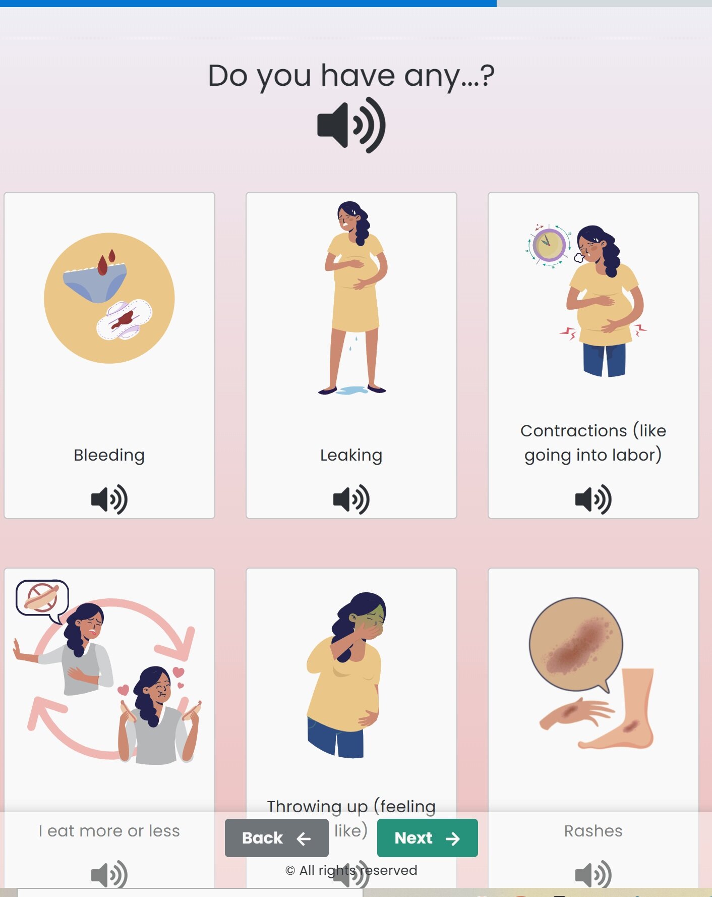
For example, during symptom intake, providing visual depictions of the human body, such patients can more easily understand and engage with the app.
If this still does not remedy the problem, giving them an “I do not understand” option can help. By simply allowing them to skip the question altogether, they are less likely to provide misleading information for the doctors.
This is just one small, yet significant way to empower them with greater control and freedom of communication.
Evaluating Comparative and Competitive Business Analyses
Comparative Business Analysis

Competitive Business Analysis

Analyzing and Identifying User Experience —
Heuristic Evaluation


We found that LiteraSeed needs to improve the clarity of categorization labels, provide more descriptive medical term information and give multiple options for users to select when they do not understand questions. By doing this, they will improve patient-doctor communication and gather more accurate data.

Empathy Map
Digging Deeper
We conducted 3 user interviews and analyzed users’ feelings, needs, and experiences through an empathy map. The empathy map allows us to gain a deeper insight into users’ behaviors and attitudes.
“I find the process confusing and difficult.”
Most of LiteraSeed users are refugees with low English literacy. We found that all 3 participants in the interview were able to understand medical terms and convey their health issues in their own native language but had trouble understanding the medical terms. Thus, they often avoided and skipped questions they didn’t understand. This often leads to miscommunication with their doctors and potentially a misdiagnosis.
Through the empathy map, we can better understand patients and design the right product for their needs.
Thus, more people will use the app resulting in business growth.

Clarifying The Target User
The key to creating a good product is to gain a clear picture of the user. To do this, we compiled and analyzed the data from all our patient interviews and develop a target user type/persona.
Creating a persona allowed us to have a greater understanding of our users' needs, experiences, behaviors, and goals. This helped us identify the patients and determine which features are the priority in providing for their needs.
Shaping The Information Architecture
We created a site map to view the bigger picture and gain perspective on navigation flow.
After taking a deeper look at the current site map, we were able to spot several areas that may be causing issues. In order to improve these problem areas, we developed a new site map and separated the pregnancy questions into 3 categories: symptoms, babies, and pain. Having organized categories like this helps the patient navigate with greater ease and gain a better understanding of the questions.
Current Site Map
Proposed User Flow
Proposed Site Map
Current User Flow
A good user flow increases the patient’s ability to perform tasks efficiently. It helps determine what is working, what is not, and what areas need improvement. The current user flow lacks organization resulting in confusion and wasted time for the patients. Thus, we created a new user flow that was divided into 3 sections: screening, women’s health, and patient feedback. Creating a better user flow like this helps the organization take one more step forward.

The Design
Initial Sketches
Category

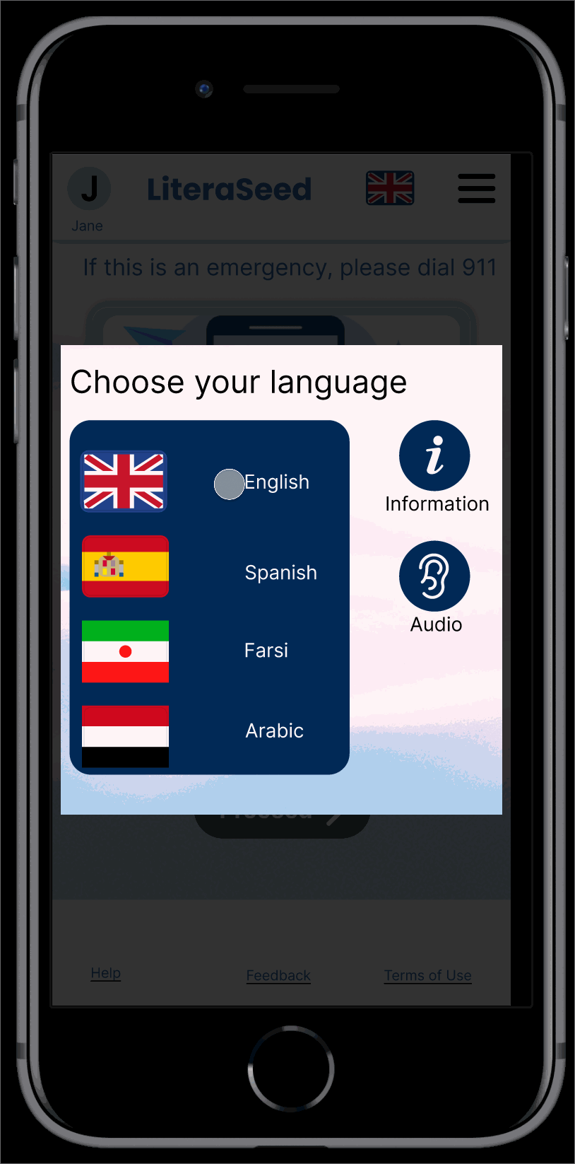
Choose The Language

Survey Questions With Help and Documentation

Paper sketches were drawn out to provide a rough draft that could easily be modified while collaborating with the team. After agreeing upon a design, the sketches are finalized into a high-fidelity format. These were later transferred to Figma.
Enhancing the design from low to high fidelity

Break the Languange Barrier
Before answering any medical questions, patients will be able to select which language they prefer the survey to be in. This will help them feel more comfortable using the app. Giving a better understanding of medical terms will also enhance the accuracy of the data they provide. Overall, this feature works towards the goal of delivering an excellent product that will help improve the medical system.


Help and Documentation
The app gives simple definitions of obscure medical terms to help patients gain a more solid understanding of their health. Furthermore, the app will provide helpful visuals to clear up any remaining confusion. If the patients understand the questions, they will be more likely to complete them resulting in an overall improvement to the accuracy of patient information.
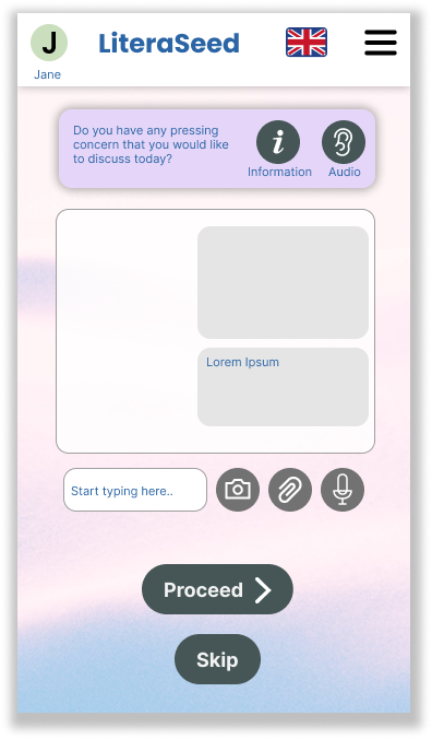
Open-ended Questions

Pop-up Window Notification
An encouraging pop-up window notification will show up after the patients complete each category. This motivates them to move on to the next task and feel more engaged in completing the survey.
At the end of the survey, users will be able to add more information about their health through voice notes, text, images, or document attachments. Thus, it improves communication between patients and doctors.

Choosing the Category
Patients can choose which category to begin in and can also decide to stop and pick up where they left off at a later time. Having this ability to choose expands user control and freedom. Thus, users can easily find and navigate through the app. This can create a positive impact on the business outcomes.

Usability Testing
Results:
Users find it clear and easy to navigate through the app
Users have a better understanding of their health condition with the help of visuals and medical term definitions
Users are more engaged in the survey after viewing encouraging pop-up windows
The app seemed clean, friendly, and approachable.
Things that Need to improve:
Users would like to view their results immediately following the survey.
Users and stakeholders would like to see a history page of the patients’ health every time the patients take a new survey so doctors can keep better track of the patients’ health.
Some users were confused if the page was scrollable or not. — “Add something to show it’s scrollable.”

Design Iteration

Add Scrollable
Helps users navigate by indicating that there is something more to read/view below.

History Review
Allows patients and doctors to review patients’ health history which can improve the accuracy of diagnoses and benefit the medical process.

Result Review
Provides immediate results following the survey along with doctor recommendations.

Reflection and Next Steps
This was an amazing project. Not only did I learn to design and collaborate with my team, I also learned more about medical terms and developed empathy for those with low English literacy facing difficulties in health care, whether in attempting to find the right doctor, or merely understanding the medical terms of their condition. I am eager to find ways to help them communicate better with their doctors so that they can get the health care they need. Our research has led us to suggest the following next steps:
Integrate the anatomical 2D images into a 3D format to further enhance patients-doctor communication
Incorporate more video visuals to help patients understand medical terms easily
Create additional language translations to provide more effective patient-doctor communication around the world.
For the future, I would like to continue learning and developing my design process so that I can benefit as many people as possible.