
ORCA
(App for Public Transit Card Mobile Redesign)

Overview
ORCA exists to give commuters and travelers a single way to pay for all modes of transportation in Puget Sound. The goal of ORCA is to unify the public transit systems in Puget Sound and make the payment system much more straightforward for each of them. They care about ease and simplicity for customers. They also care about providing options for youth, seniors, low-income customers, people with disabilities, and more. However, Their current website is not user-friendly and often leads users to confusion because the website is overwhelmed. Thus, reducing overall sales.
Team: 3 people
Duration: 2 weeks
Role: UX/UI Design
Platform: Mobile Application

Tools and Methods

Persona
Card sorting
Site Map
Figma
Wireframing
Prototyping
Usability Testing
Comparative and Competitive Analysis
Business Analysis
Heuristic Evaluation
Journey Map
Survey
User flow
Iteration

The Challenge
ORCA’s website is inconvenient and unclear, which makes it difficult for users to check and load their ORCA card balance while on the go. This causes their customers to become frustrated and impatient instead of having an easy and enjoyable user experience.

User Frustration And Confusion
“Frustrated with the amount of effort that goes into paying for a ticket”
“Too much confusion when navigating ORCA site, wanting to accomplish tasks efficiently”

Possible Solution

We believe if we redesign ORCA’s website to include clearer navigation, simplified organization, and convenient access to account information on demand, then users will be able to use the site more efficiently, enjoyably, and increase overall sales.

Organize topics for clearer navigation

Simplified Information Architecture

How To Solve This…
Understanding the Business is important before making the appropriate changes to the website. I want to implement the changes in order to make a more user-friendly website.
Talk About Business
We did research on Comparative and Competitive Analysis.
Competitive and Comparative Analysis helps me and my team identify business key elements for a better user experience.
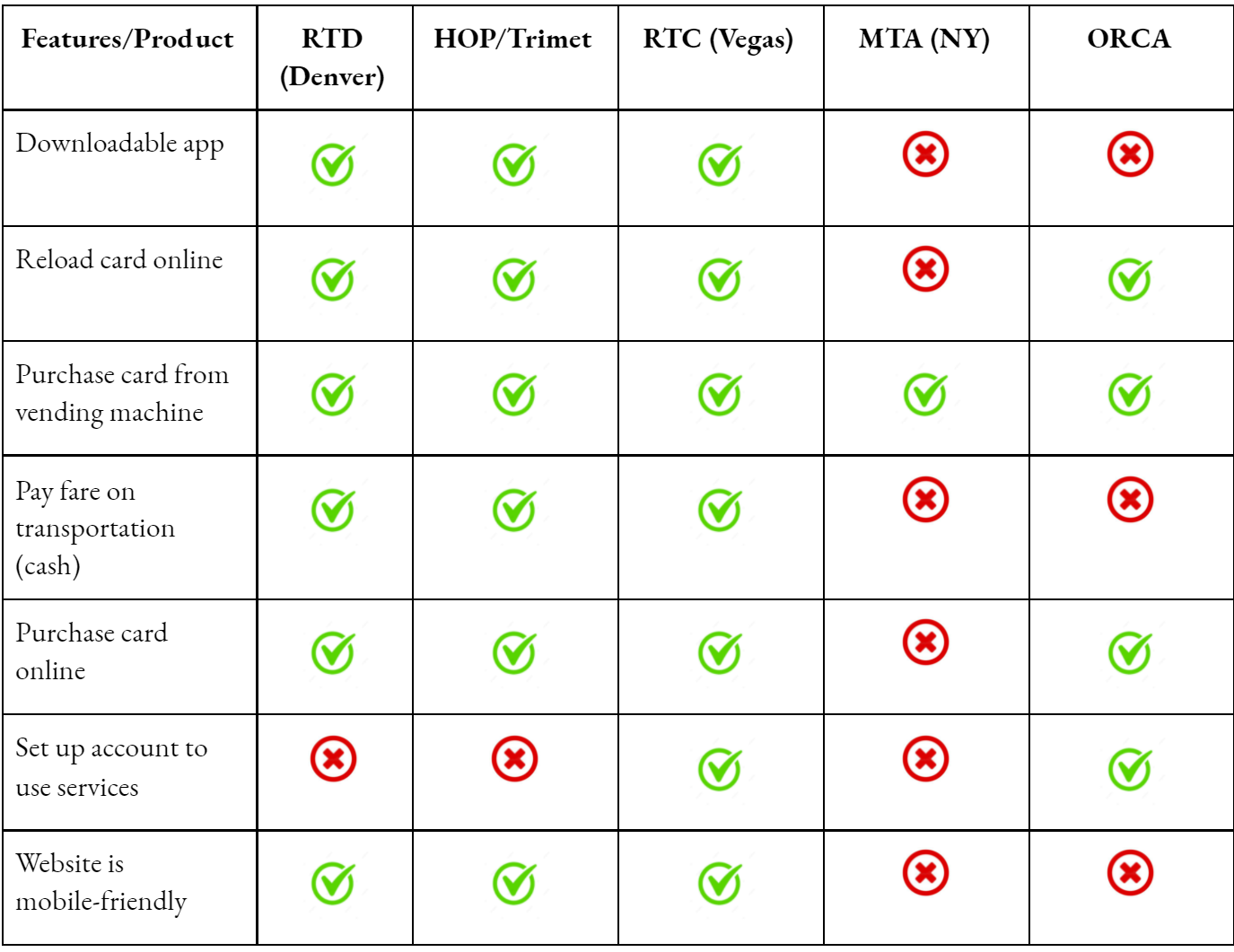
Competitive Business Analysis

Comparative Business Analysis
What We Found…
We found that sites in both competitive and comparative were mobile-friendly, had options to create and manage an account, and had the ability to complete a purchase online. ORCA currently does not have mobile-friendly options and the online portal to purchase fare and manage an account are difficult to navigate.
Understand User Deeper
Our team collected data from varied audiences and develop an empathy map to observe more actions and feelings based on the follow-up interviews and Journey Map to help visualize the highs and lows of the user's touchpoints.

Empathy Map
Through the empathy map, we found that some users said: “The website is confusing“, they think “the information on the website is overwhelmed” and they feel that ”the website is difficult to navigate”. As a result, they often “abandoned the website”
Thus, This reduces the overall sales. As a UX designer, my biggest advocate for the user is ensuring an enjoyable and stress-free product. Having a deeper insight into user needs and understanding the users from an empathetic on how they think, feel, and what they need will improve ORCA Business to meet their expectations and increase their business sales.

Journey Map
Fully understanding the user's interaction is essential in determining how our feature enhancements would optimize the user experience. Journey Map helps to visualize the highs and lows of each of the user’s touchpoints. Through the journey map, I was able to visualize customers’ stories on how they feel at all brand touchpoints so I can avoid potential issues ahead of time, increase customer retention, and discover key information to make the best decisions.
Clarifying The Target User
Based on interviews and survey results, we created a persona to represent users’ goals, needs, behavior, and experience. Identifying pain points and behaviors helps us determine which features we need to improve for a better user experience and interaction.

We created a site map for ease of use of the app. Through the site map, our team was able to redesign some pages such as the homepage, check balance, add credits, buy new cards, and transaction history.
To Simplify the current workflow system
Site Map

Creating the Visuals
We began our design process with sketches and later transfer the designs to Figma. We developed our sketches and designs from screen to screen flow for better user interaction.
Initial Sketches


We incorporated several of these ideas into our finalized designs, focusing on recreating the feeling of connection via digital interface.
Transferring Design From low to High Fidelity


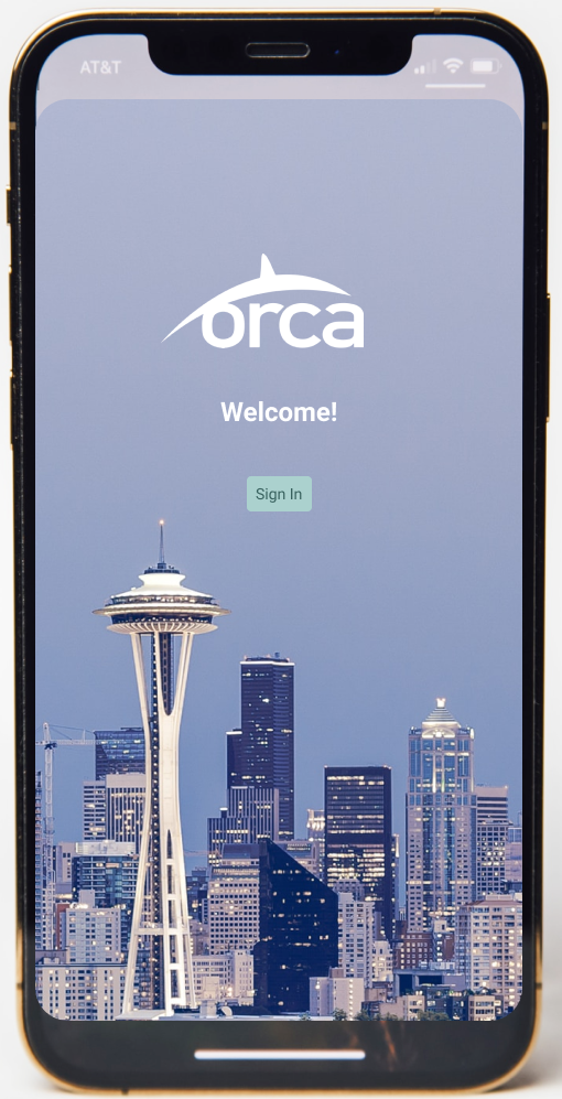
Login Page
Users can create a new account or sign in directly on the existing account. This will allow users to have easy access and a convenient way for them to manage their account information.
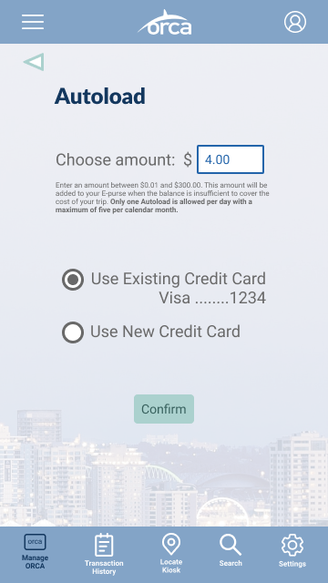
Quick Add and Autoload
Provide a quick option for users to select the balance or enter the amount manually. Users can also set up an autoload payment once their card runs into low balance so they don’t need to worry whether they have enough balance or not to ride a bus, train, fare, etc.


Buy A New Card
Here, users will be able to select what types of passes they want to buy, how many cards they would like to purchase, and add balance into their new card. Thus, it helps users to calculate the cost easily depending on what type of passes they are going to buy.

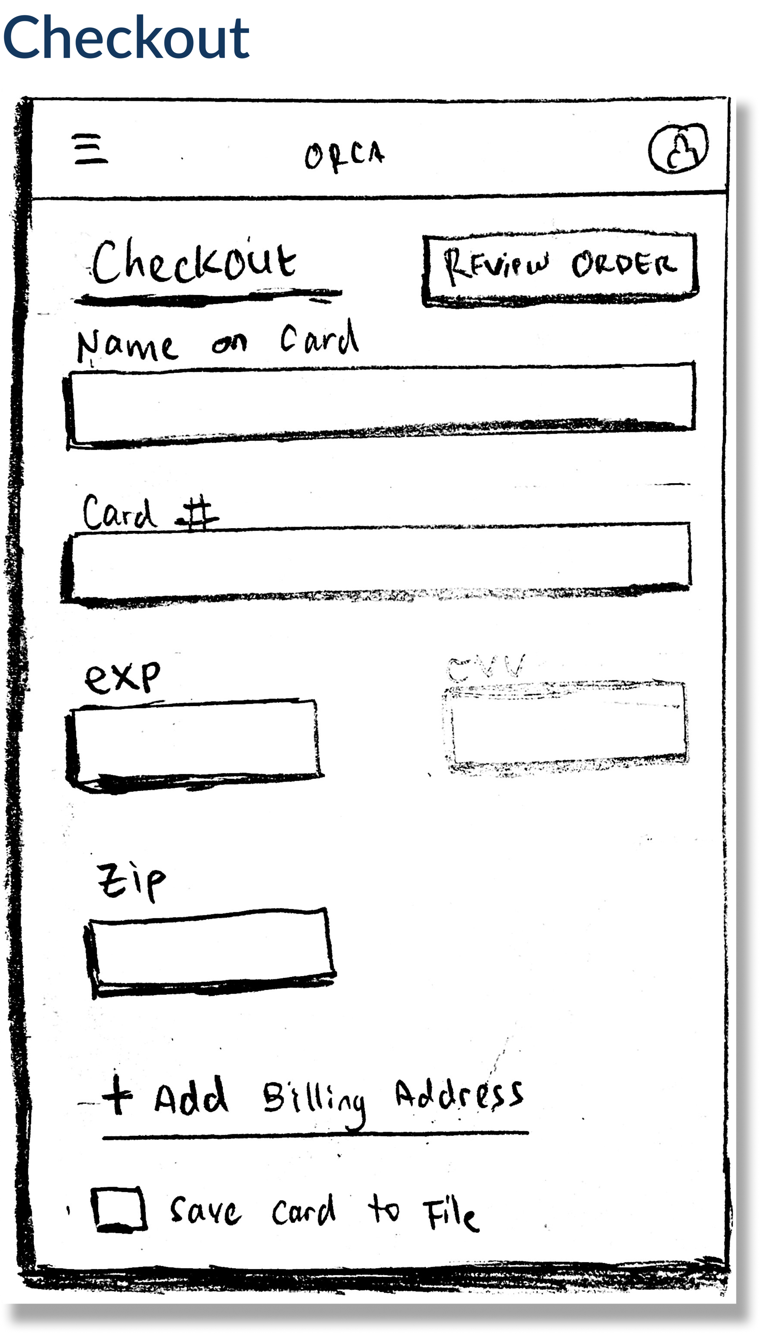
Checkout
Allow users to have multiple payment methods whether they would like to buy the pass through Google, Apple pay, or enter their credit card information manually.
It also gives users an option to add another billing address as well as provides access for users to whether or not they would like to save their card information for future payment.


Usability Testing

Result:
Users find it easy and clear on adding balance, checking transaction history, and setting up autoload
Things Need To Improve:
Users want to know a quick way on how much the rates cost per ride
Some participants want to see a more explicit description of payment methods across the entire platform
Users would like to find a kiosk location where they can add their balance physically
Some participants are confused with the checkout whether or not they are required to fill out all the payment information

Design Iteration

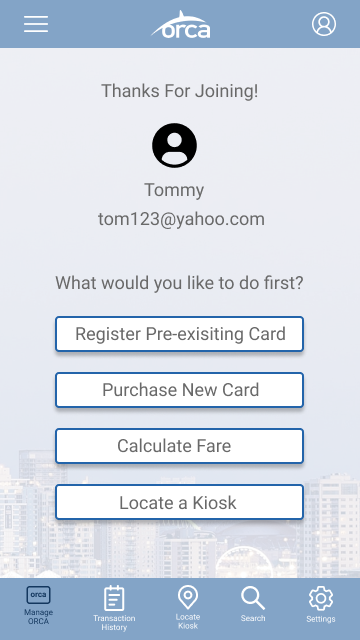
Next Step After Signing Up
Show confirmation after a user has been successfully created an account
Give clear direction for users to choose what they want to do after creating a new account
Allow users to have the flexibility by providing multiple options

Checkout Flow
Inform users that there is required information to be filled out
Prevent users from failing to input the required information
Assist users in finding CVV code quickly in case they don’t know where to find it

Buy New Card
Shows how much passes cost and how soon they arrive
Gives a clear option to add funds or not

Fare Calculator
Allows users to check fare rates in advance
Better ability to plan commuter budget
Works with all modes of public transit

Quick fare Guide
Users wanted a quick way to know how much to add balance to cards
Calculates a one-way fare based on the mode of transit and distance

Kiosk Locator
For users who want to use physical kiosks for transactions
Especially for those who want to add money via cash

Reflection and Next Steps
This was a fun project to work on with a great team where everyone shared amazing ideas and come together to refine the best solution we can offer. If this project were to continue, our main goals are to:
Add iterations to prototype
Develop desktop prototype
Further rounds of usability testing
Target user interviews
In maintaining the goal of increasing the app functionalities for a better user experience, I came up with dream features based on usability testing:
Allow funds to be available immediately
Digital card that can be scanned on buses, trains, light rail, etc. directly from a mobile account
Sending an email to customers with a temporary card/barcode that riders can access while they wait for their ORCA card to arrive